This article is meant for beginners that never heard of or never used a Pivot Table.
Pivot Table (PT) is a powerful feature in Excel for analyzing, slicing and dicing data. Many people know about it, but have never used it. I met a professional with MBA credentials who said they (not to disclose the gender) are afraid of PTPivot Table. In this post I will de-mystify the PTPivot Table myth.
As many of you know, data requires processing to become information. REMEMBER: For data to become information, one must distill meaningful results that will help convey a message (e.g. anomaly, event, pattern, favourable or not, effects, correlation, etc.).
Let’s say you have a flat table (columns and rows) with data. You can analyze it in 2 ways:
- Add a filter to column headers and filter manually any number of columns to observe a pattern. You can also use Advanced Filter, but that’s a topic for another post.
- Insert a PTPivot Table that sources data from your flat table. This is the objective of this post.
I like to compare PTPivot Table to Origami. “The goal is to transform a flat square sheet of paper into a finished sculpture…” In Excel the “finished sculpture” is flexible and ready for further manipulations. You can always add finishing touches (sort, filter, group, etc.) to your pivot table. So, imagine folding your flat table with numerous columns and thousands of rows into a summary table with readable layout. The key words are “summary” and “readable”:
- Summary – PTPivot Table will display subtotals for each intersection of columns/fields selected. This explanation might not be clear enough unless we use an example. So, bear with me.
- Readable – I mean few columns and few rows. A PTPivot Table usually fits into a screen and can be easily interpreted.
REMEMBER: to build a PTPivot Table, it is very important to have a quality data source. Prerequisites for good data source:
- no blank/empty columns or rows
- each column has consistent data (e.g. date, description, values, etc.)
- each column has a header
- a column with values (e.g. currency, quantity, etc.) should not have:
- empty cells. There is a value that represents nothing or empty, it’s 0 (zero). I will add a post how to quickly replace empty non-adjacent cells with 0.
- cells with text or number displayed as text.
Nothing extreme so far. I hope it is not overwhelming for beginners.
Let’s work on an example to better understand the concept. The simplest and most accessible for everyone would be bank statement. You can get this data from your online banking (1. download a CSV file and open in excel, 2. select all the rows with data, copy and paste it to an empty excel WSworksheet). If you don’t have an online banking account and still receive your statements printed on paper, maybe now is the time to get more environmentally responsible and go paperless. Usually there are the following columns(headers): Date, Description/Store, Category and Amount. Make sure your data has all the prerequisites listed above.
To insert a PTPivot Table, follow these steps:
- Click anywhere in your data. This tells Excel you want to work with that range of cells. (Image 1)
- Got to tab ‘Insert’, in the ‘Tables’ group, click on ‘PivotTable’ button. (Image 2)
- Click ‘OK’ in the ‘Create PivotTable’ dialog box (pop-up window). As soon as dialog box will pop-up, you can observe how Excel will select the entire range of cells with data. This is shown by a dotted line around your data. Let’s ignore the options in the dialog box for now. (Image 3)
- As a result Excel will add a new WSworksheet with a blank PTPivot Table (Image 4)
Image 1
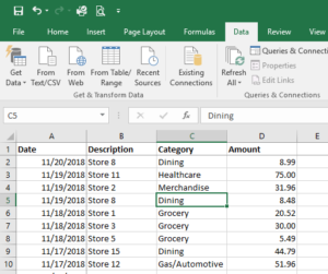
Image 2
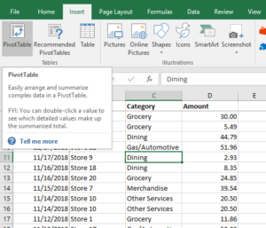
Image 3
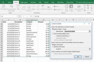
Image 4
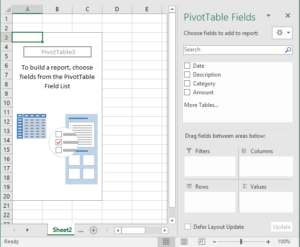
Please notice on the right side ‘PivotTable Fields’ pane opens automatically to allow us populate the PTPivot Table. In the default layout it will display available columns/fields in the top section of the pane and the schematic layout of a standard PTPivot Table in the lower section. How is a PTPivot Table different from a flat table? A flat table has only column headers and data organized in rows. PTPivot Table has both column headers and row headers, or certain columns can be “pivoted” into rows.
To populate this PTPivot Table, follow these steps:
- Drag the field ‘Category’ into the ‘Rows’ area. Notice how it fills with unique (non-repeating) categories down.
- Drag the field ‘Amount’ into the ‘Values’ area. Notice how it fills with subtotals for each category.
- Drag the field ‘Description’ into ‘Columns’ area. Now it will give you the store details for each category across (Image 5) or into ‘Rows’ area to be able to analyze each category by stores (Image 6).
Image 5
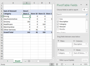
Image 6

Please note how PTPivot Table automatically updates with new numbers (subtotals for each intersection). Dragging fields between ‘Columns’ area and ‘Rows’ area will give you new looks and new perspectives. There is no right or wrong answer. You can try moving fields around until you find a layout that will help you distill meaningful results and will help you convey a message. Changing the layout/look of your PTPivot Table does not change your underlying data, so don’t be afraid to experiment.
